Even as he was condemned by health experts, Republicans from his own state, and in a rare instance, President Donald Trump, Gov. Brian Kemp used data models to justify reopening Georgia on April 30. But were the numbers he used, real?
Because of the way the data was presented in the report, the data could have been misinterpreted.
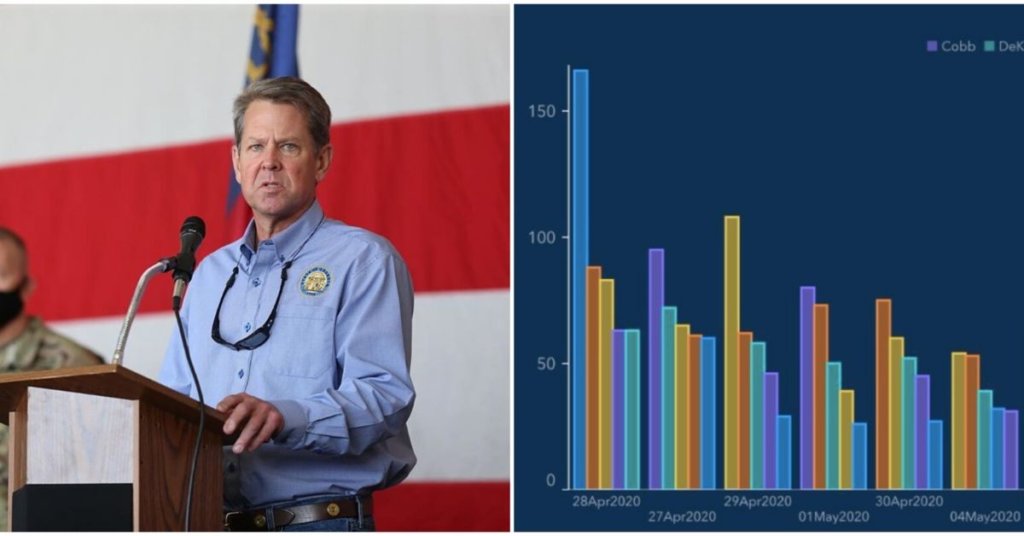
While providing up-to-date information on the pandemic in the state, Georgia’s Department of Public Health (DPH) mixed up the order of dates and the hardest-hit counties in a graph to make it look like its COVID-19 cases were systematically declining.
The state of Georgia made it look like its covid cases were going down ***by putting the dates out of order on its chart*** May 5 was followed by April 25, then back to May again, whatever made it look like a downslope. https://t.co/H8pSvY6rxn
— David Fahrenthold (@Fahrenthold) May 17, 2020
